Hey everyone! So here is my updated progress on my site design.
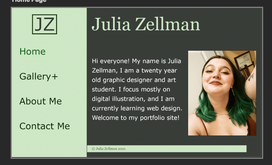
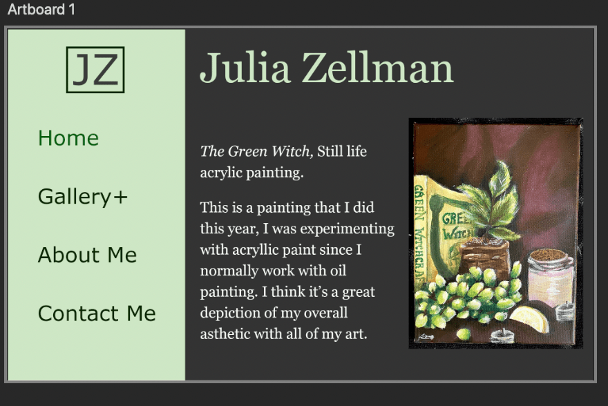
Judging by the feedback I got, I think that I’ll be going with the darker background option. It looks more professional l and shows off the art better. That being said, I made some tweaks to both designs and have them both here, so I’d love to hear if you agree with going with the darker design for the final site.
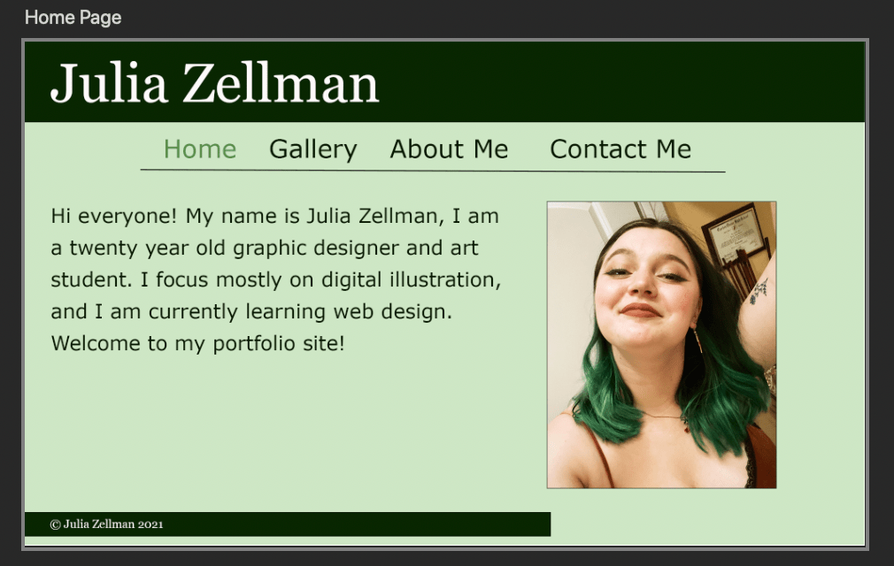
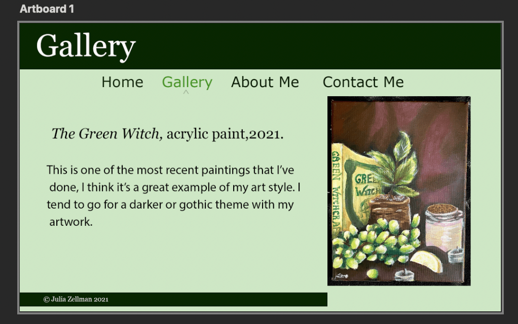
For the lighter option, I toned down the green colors and tried to make them a little more muted as to not clash with my work. (Since I’m using my site as a portfolio site).
For the darker option, I decided to play with a different layout, and added a sidebar as opposed to my old menu at the top of the page. I saw a lot of my peers using this menu option and I think it looks cleaner.
I also got rid of the extra sidebar I had on my gallery page, which showed the different sections of my portfolio. It was confusing and took up too much space on the page. Instead, I plan to just have an extension on my gallery button where you can hover over it and then choose which section of my portfolio to access.
Option One (light):
Option Two (Dark):

I love the second design. It looks more professional. Also great painting!!
LikeLike
Like the colors and think that the layouts are good
LikeLike