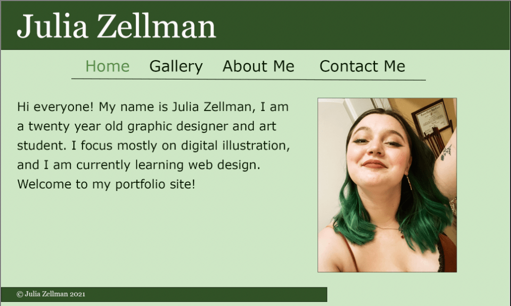
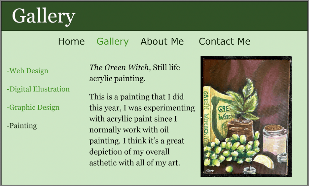
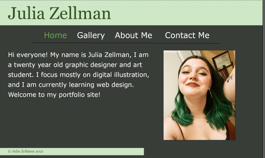
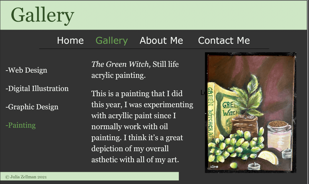
Hey everybody! These are my two ideas for website designs now. I think that I definitely know what kinds of colors I want to work with (primarily cool colors), but I’m not sure if I want a light or a dark website. I included both here, so I’d love to hear which you guys prefer.
I’m using this site as a portfolio if that helps in your decision making! 🙂


OR


I like the color of the layout and think it makes them look nice and think that the best layout option is 2 the 4 layout is the best
LikeLike
I really like the vibe of your layout. I think the first idea is better. It goes well with the painting you used as an example and I feel like it matches your personality well.
LikeLike
I really like both of the color schemes you chose. The gray is a bit more neutral, so I would maybe go with that one. However, I do like the look of the green in the first layout too. I also really like how you’ve set up your home page on your WordPress site!
LikeLike
Hey Julia, I personally love the lighter colors over darker one. I think the lighter ones feels much livelier and it matches the theme you have presented. Both colors theme reminds of websites that sell Green Tea Mochi.
LikeLike
Hey Julia, I do like the your dark option, but I like the flow of your first option and how it complements your acrylic painting. In my opinion, I feel like it has a better connection to it. I am leaning more towards the idea of having your navigation menu floating instead of having an underline, and possibly getting rid of the footer.
LikeLike
Hey Julia, I like your color choices for your website designs, but I like the first one more because I think it makes your website stand out better.
LikeLike
Hi, Julia! Of your two directions, the second is the one that I prefer, primarily because the design and color distribution allow the artwork to stand out while still adhering to the website’s analogous green color scheme. The one criticism that I do have for the layout is that the light green bar at the bottom containing the website’s copyright info should extend across the entire bottom of the webpage.
LikeLike
Hey Julia,
I wanted to start off by saying that it is exciting to see how many different categories you have under your gallery tab and I’m excited to see all work you’ve created. I also think that your second design highlights your work better. The gray background doesn’t take away from the work as much as the green background does.
LikeLike